Empowering Through Connection:
Redefining Weight Loss.
Empowering Through Connection:
Redefining Weight Loss.
Background
Background
Losing weight is easier when doing it together
Losing weight is easier when doing it together
Better Together is an Israeli well-being startup and is on a mission to help customers lose weight easily and embrace a healthier lifestyle.
The app stands out by fostering intimate connections through small support groups, creating a community-driven approach to weight loss.
My mission was to breathe new life into the app's user experience (UX) and redesigning the user interface (UI). This approach included user research, market research, and innovative design thinking.
Better Together is an Israeli well-being
startup and is on a mission to help customers lose weight easily and embrace a
healthier lifestyle.
The app stands out by fostering intimate connections through small support groups, creating a community-driven approach to
weight loss.
My mission was to breathe new life into the app's user experience (UX) and redesigning the user interface (UI). This approach included user research, market research, and innovative
design thinking.

Stakeholders
Stakeholders
A Single Designer But Not Alone
A Single Designer But Not Alone
I consistently communicated progress with stakeholders, actively seeking feedback from the Better Together team, including valuable input from founders on engineering and creative aspects.
I consistently communicated progress with stakeholders, actively seeking feedback from the Better Together team, including valuable input from founders on engineering and creative aspects.
Problem
Problem
Diagnosing What Needs To Change
Diagnosing What Needs To Change
A critical assessment of the existing app revealed a concerning trend: low conversion rates to the pro plan and unfavorable user reviews.
These indicators underscored the need for a redesign.
The project's initiation involved a dual-pronged research strategy, delving into user insights and unraveling the strengths and weaknesses of competitors.
User analysis
User analysis
Unveiling the Pain Points
Unveiling the Pain Points
To learn about the problems faced by users while using the app, I went through all the reviews we received on questionnaires and conducted an analysis of the most common problems and claims. My research, based on two different questionnaires answered by more than 5000 different users, illuminated several key points.
To learn about the problems faced by users while using the app, I went through all the reviews we received on questionnaires and conducted an analysis of the most common problems and claims. My research, based on two different questionnaires answered by more than 5000 different users, illuminated several key points.
Prior to conducting the analysis, I made a list of questions to confront in the proccess:
Prior to conducting the analysis, I made a list of questions to confront in the proccess:
Who are Better Together users?
Why do they use the app?
Which features do they use the most?
How do they perceive the app?
What leads to the low conversion numbers?
Who are Better Together users?
Why do they use the app?
Which features do they use the most?
How do they perceive the app?
What leads to the low conversion numbers?
This revealed a predominant user demographic of females aged 24-43 utilizing the app primarily for weight loss.
Users faced difficulty navigating through the home page and group page.
Almost all users didn't use the story bar on the home page and didn't know how to reach it.
The app was perceived as a quality app, but users felt it wasn't a necessity and could be replaced.
The transition between the free trial period, where all features are open, and the non-paid user interface, where most are blocked, was not clear, leading many users to stop using the app and feel anger towards it.
This revealed a predominant user demographic of females aged 24-43 utilizing the app primarily for weight loss.
Users faced difficulty navigating through the home page and group page.
Almost all users didn't use the story bar on the home page and didn't know how to
reach it.
The app was perceived as a quality app, but users felt it wasn't a necessity and could be replaced.
The transition between the free trial period, where all features are open, and the non-paid user interface, where most are blocked, was not clear, leading many users to stop using the app and feel anger towards it.
Sara Williams
Weight Loss Enthusiast and Supportive Friend
29 / Female
Socioeconomic status
Middle-class
Marital status
Single
Occupation
Marketing specialist
Location
Naperville, Illinois
Determined to shed pounds, Sarah inspires loved ones to prioritize health. Using her app with a fitness tracker, she stays motivated with daily tips and fosters connection through the chat feature.
User Traits
Archiver
Care for others
Social
Pain Points
Work-life balance leads to stress-induced unhealthy habits.
Motivating friends and family is challenging due to commitment variations.
App glitches make tracking fitness data difficult.
Consistency falters during busy periods, hindered by forgetfulness.
Lisa Smith
Weight Loss Seeker and Wellness Advocate
39 / Female
Socioeconomic status
Upper-middle-class
Marital status
Married +2
Occupation
Registered Nurse
Location
Brooklyn, NYC
Dedicated to weight loss, Lisa inspires family and friends to prioritize health. Using her app for water reminders, she values tracking daily activities for holistic health.
User Traits
Loving & caring person
Health aware
Pain Points
Balancing work and motherhood challenges exercise and meal prep.
Family resistance to healthier habits is disheartening.
Consistent water intake is challenging; app input is occasionally forgotten.
Juggling career and family exhausts her, making motivation and commitment challenging.
James Paul
Weight Loss Focused and Team Player
33 / Male
Socioeconomic status
Lower-middle-class
Marital status
Married
Occupation
Electrician
Location
Savannah, Georgia
Dedicated to weight loss, James syncs his app with a fitness tracker, prioritizing simplicity. Despite a demanding job, he faces challenges keeping the group engaged, dealing with connectivity issues, and balancing family, work, and weight loss efforts.
User Traits
Goal focused
Team player
Pain Points
Physically demanding job hinders regular workouts.
Engaging friends and family in the weight loss group is challenging.
Connectivity issues frustrate progress tracking.
Balancing family, work, and weight loss results in inconsistent app usage and exercise routines.
Market research
Market research
Competitive Intelligence: Learning from the Best
Competitive Intelligence: Learning from the Best
Understanding that innovation thrives on inspiration, I conducted a comprehensive market research.
Insights from direct competitors leading apps such as Noom, Weight Watchers, and Google Fit informed the strategic direction, drawing lessons from their successes and pitfalls.
I was also inspired by Headspace, Rise, Lifesum, and many others.
Analyzing the competitors lead me to several findings:
Apps allow tracking of single users' calories, steps, water, and nutritional values.
Arrange the data in an easy-to-understand layout. Enable customization through questionnaires. Present users' data using progress bars.
Use short and attractive paywalls to convert users to premium plans.
Apps allow tracking of single users'
calories, steps, water, and nutritional values.
Arrange the data in an easy-to-
understand layout.
Enable customization through questionnaires.
Present users' data using progress bars.
Use short and attractive paywalls to
convert users to premium plans.
Long and frustrating questionnaires.
No encouraging features.
Focused only on one aspect of weight loss:
Diet or sport.
Little to no information about premium features in the paywall.
Long and frustrating questionnaires.
No encouraging features.
Focused only on one aspect of weight loss:
Diet or sport.
Little to no information about premium features in the paywall.
Lets have a look at the old design
Lets have a look at the old design


Current design challenges
Current design challenges
Identifying the Flaws
Identifying the Flaws
The questionnaire analysis uncovered significant challenges existing in the design:
The questionnaire analysis uncovered significant challenges existing in the design:
Cumbersome navigation, demanding excessive scrolling and clicking.
User confusion around specific tasks.
Screens cluttered with redundant features.
Poor visibility of paywall and free trial prompts.
A limited value proposition compounded by an outdated UI design.
Cumbersome navigation, demanding excessive scrolling and clicking.
User confusion around specific tasks.
Screens cluttered with redundant features.
Poor visibility of paywall and free
trial prompts.
A limited value proposition compounded by an outdated UI design.
Design process
Design process
Revitalizing User Flow: Navigational Harmony
Revitalizing User Flow:
Navigational Harmony
The integration of new features needed a comprehensive overhaul of the entire user flow.
The outcome was a vastly improved navigation experience with heightened functionality, ensuring
a seamless journey for users.
The integration of new features needed a comprehensive overhaul of the entire user flow.
The outcome was a vastly improved navigation experience with heightened functionality, ensuring
a seamless journey for users.
Log in / Sign up
Onboarding
Home screen
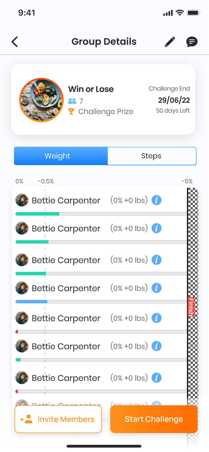
Group
Manage group
Group weight
Group steps
Group Info
Dietary plan
Onboarding
Weekly plan
Recipe
Add data
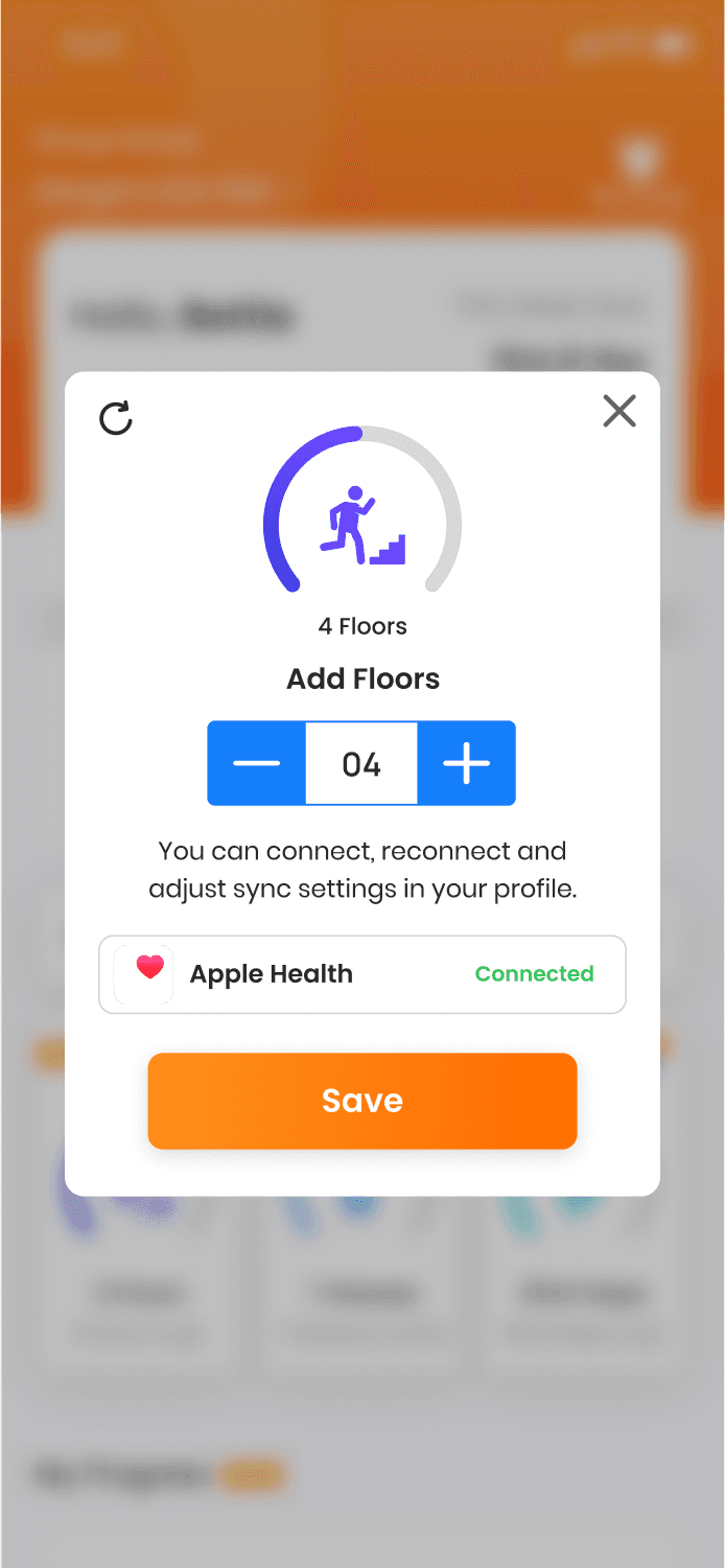
Add floors
Add glasses
Add steps
Add weight
Convert activity
Log in / Sign up
Onboarding
Home screen
Group
Manage group
Group weight
Group steps
Group Info
Dietary plan
Onboarding
Weekly plan
Recipe
Add data
Add floors
Add glasses
Add steps
Add weight
Convert activity
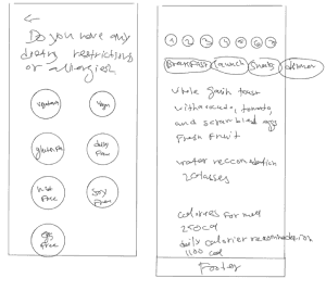
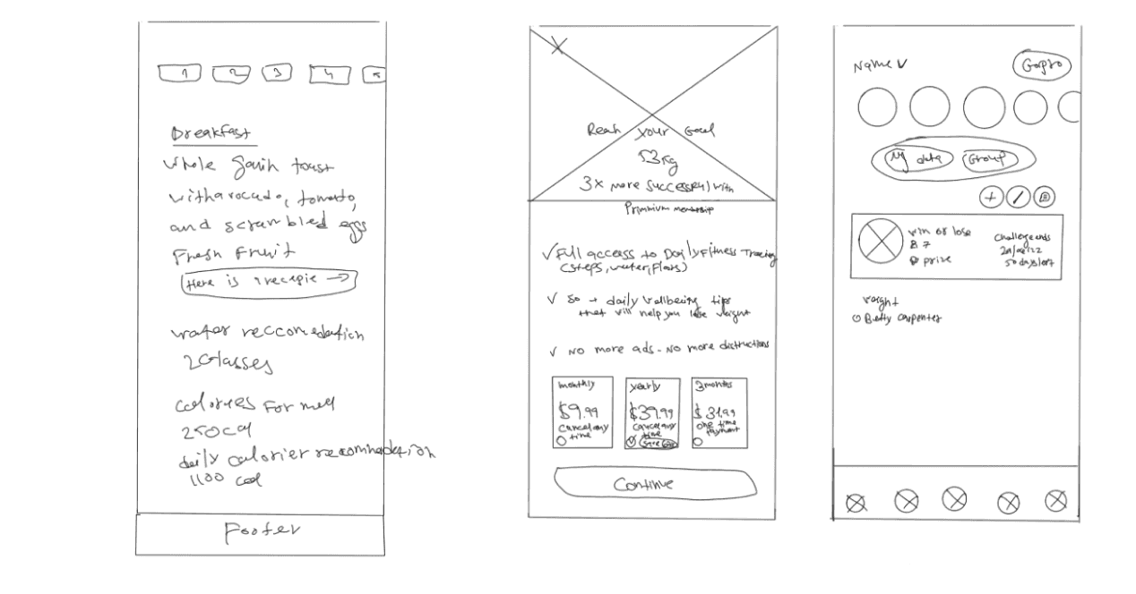
Low fidelity sketches
Low fidelity sketches


Solution
Solution
Bringing Designs to Life: Iteration and User Testing
Bringing Designs to Life: Iteration and User Testing
The final designs were a culmination of multiple iterations, incorporating user testing and feedback.
The final designs were a culmination of
multiple iterations, incorporating user testing
and feedback.
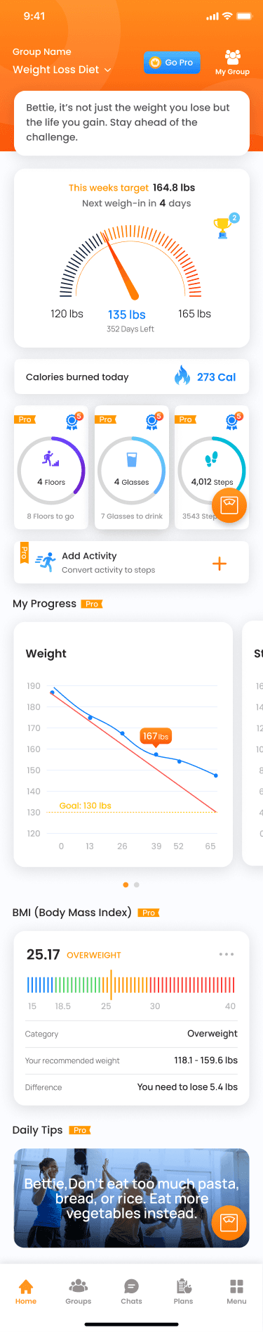
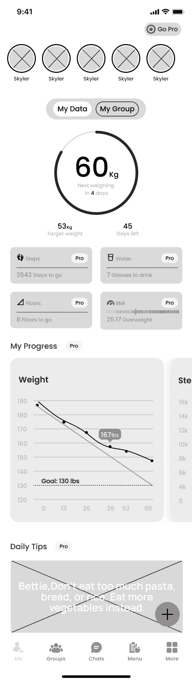
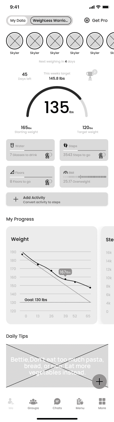
The Home Page
The Home Page
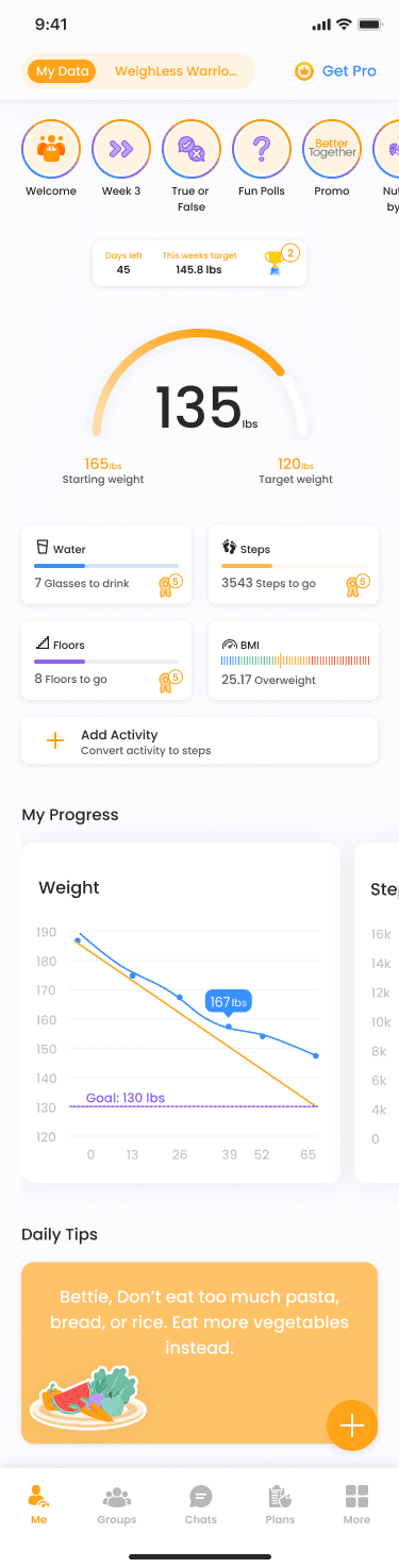
Based on the user research findings, a reorganization of information was needed to happen on the app's home page.
Based on the user research findings, a reorganization of information was needed to happen on the app's home page.
Here are some of the problems I discovered:
Here are some of the problems I discovered:
The information hierarchy was wrong, space was given to less-used features.
Users did not recognize the stories and skipped this feature almost completely.
Users complained about the overwhelming amount of data.
Repeating Pro tags were placed aggressively all over the page.
Long process to move from homepage to new flows.
Irrelevant features were removed.
Less used features were shrunk.
The main home page feature data (weight progress bar) was rearranged.
Pro tags were removed, left with only the “get pro tag.”
A hovering "Add button" was placed in the bottom right of the screen, enabling easy access to the Add data flow.
I came up with solutions to these problems:
I came up with solutions to these problems:
Irrelevant features were removed.
Less used features were shrunk.
The main home page feature data (weight progress bar) was rearranged.
Pro tags were removed, left with only the “get pro tag.”
A hovering "Add button" was placed in the bottom right of the screen, enabling easy access to the Add data flow.
Iterations

Why I choose this version
Despite being information-rich, the screen maintains a light and airy feel, ensuring users can absorb content effortlessly. That's thanks to a new hierarchy of features, starting with the center feature, a weight loss bar.
Concealed secondary information bars prompt users to scroll for more details. Aligned with the design language, stories add appeal without overshadowing vital features.
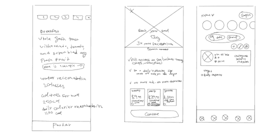
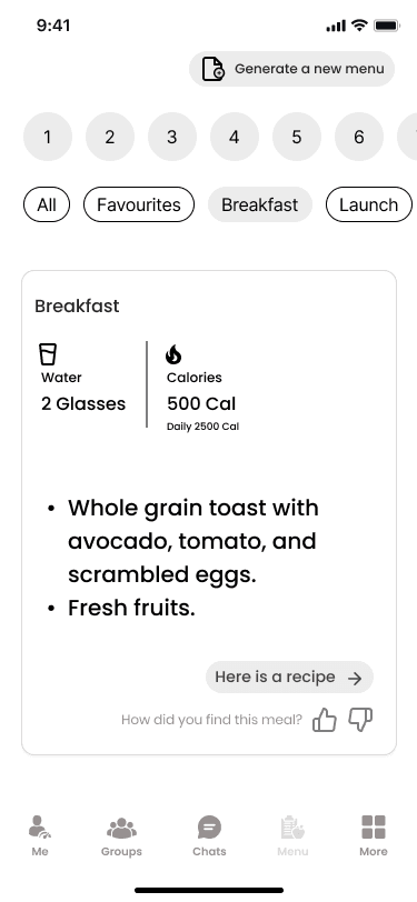
The Dietary Plan Screen
The Dietary Plan Screen
This flow of screens is a new addition to the app, based on user needs that surfaced from questionnaires. In order to understand what features and data are most important, I delved back into market research. My insights led me to arrange a list of questions that helped me define the content of the flow and screens.
This flow of screens is a new addition to the app, based on user needs that surfaced from questionnaires. In order to understand what features and data are most important, I delved back into market research. My insights led me to arrange a list of questions that helped me define the content of the flow and screens.

With answers to my questions and knowledge gathered from competitors, I defined some of the content:
With answers to my questions and knowledge gathered from competitors, I defined some of the content:
Free navigation between days and meals.
Caloric & nutrition value of the meal while showing the daily amount.
Optional feedback for every meal to educate the AI generator.
Recipe proposal with easy-to-understand data and instructions.
Free navigation between days and meals.
Caloric & nutrition value of the meal while showing the daily amount.
Optional feedback for every meal to educate the AI generator.
Recipe proposal with easy-to-understand data and instructions.
1st iteration

2nd iteration
Recipe

Daily menu

Meal menu

Recipe

1st iteration
2nd iteration
Recipe
Daily menu
Meal menu
Recipe
Why I choose this version
Post-questionnaire, users access a personalized menu with options to filter meals. Like/Dislike buttons improves customization. Recipe details aid weight management.
Visual design
Visual design
Crafting Visual Design and Branding: An Aesthetic Symphony
Crafting Visual Design and Branding: An Aesthetic Symphony
Colors
Colors
The color palette selection was a meticulous process, with the existing orange inducing excitement, complemented by blue and purple for relatability, creating a visually stimulating design.
The color palette selection was a meticulous process, with the existing orange inducing excitement, complemented by blue and purple for relatability, creating a visually stimulating design.
Typography
Typography
Poppins
Aa
Regular
Abcdefghijklmnopqrstuvwxyz
SemiBold
Abcdefghijklmnopqrstuvwxyz
Bold
Abcdefghijklmnopqrstuvwxyz

Illustrations
Illustrations

Takeaways
Takeaways
Reflecting on the Process and Envisioning Future Steps
Reflecting on the Process and Envisioning Future Steps
This project demanded more than design expertise; it required critical thinking, meticulous attention to detail, and a human-centered design approach.
It also gave me valuable experience in handing off deliverables for development in a consumer-facing environment. Adapting to user needs and personas, I sought to implement minimal yet impactful changes. The result is an intuitive and functional feature that fosters a positive environment for weight loss.
Looking Ahead: Future Horizons
Looking Ahead: Future Horizons
The journey doesn't conclude with the redesign; it merely enters a new phase.
The roadmap includes-
The journey doesn't conclude with the redesign; it merely enters a new phase.
The roadmap includes-
Implementation of a weekly shopping cart generated from the entire week's recipes.
Introduction of additional free features to augment the app's overall value proposition.
Implementation of a weekly shopping cart generated from the entire week's recipes.
Introduction of additional free features to augment the app's overall value proposition.
In conclusion, this redesign ensures Better Together aligns seamlessly with user expectations, providing an enriched and streamlined experience that goes beyond a simple app, becoming a trusted companion on the path to a healthier life.
In conclusion, this redesign ensures Better Together aligns seamlessly with user expectations, providing an enriched and streamlined experience that goes beyond a simple app, becoming a trusted companion on the path to a healthier life.
Let's Embark on a
New Adventure Together
0525458804
Let's Embark on a
New Adventure Together
0525458804